Covestro
Branding
Post-pandemic, Covestro was looking to encourage the use of its community spaces with a rebrand. Using the “cov” from their name, they opted to call their cafeteria the Cove and their general communal space the Alcove. The ask was to highlight the first three letters of Covestro to showcase the connection to the company name and the two logos to each other.
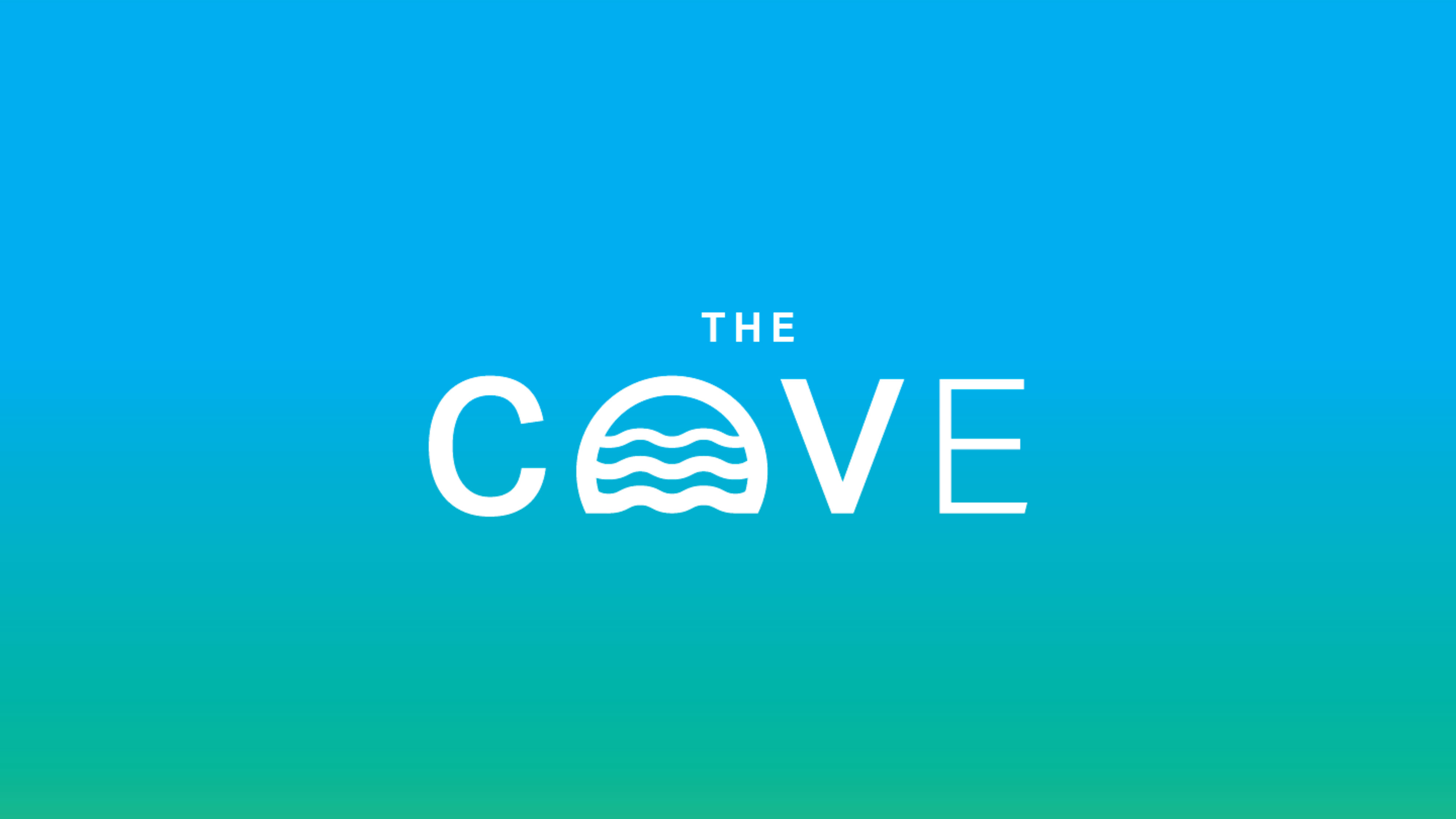
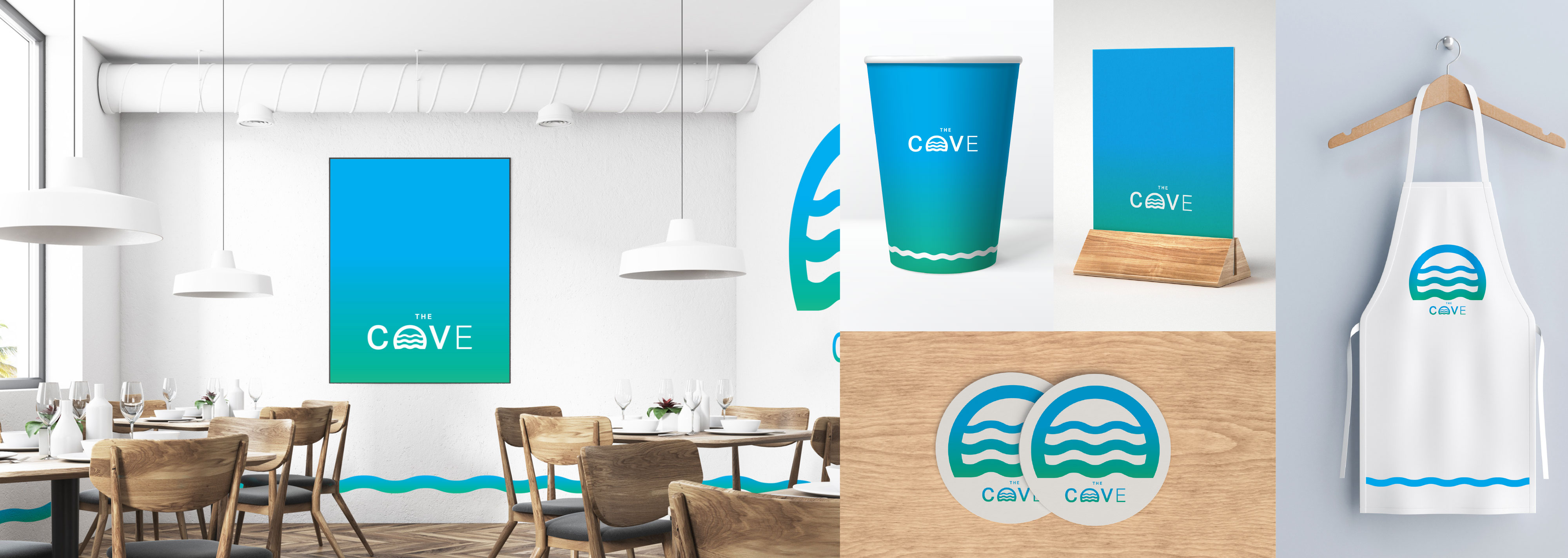
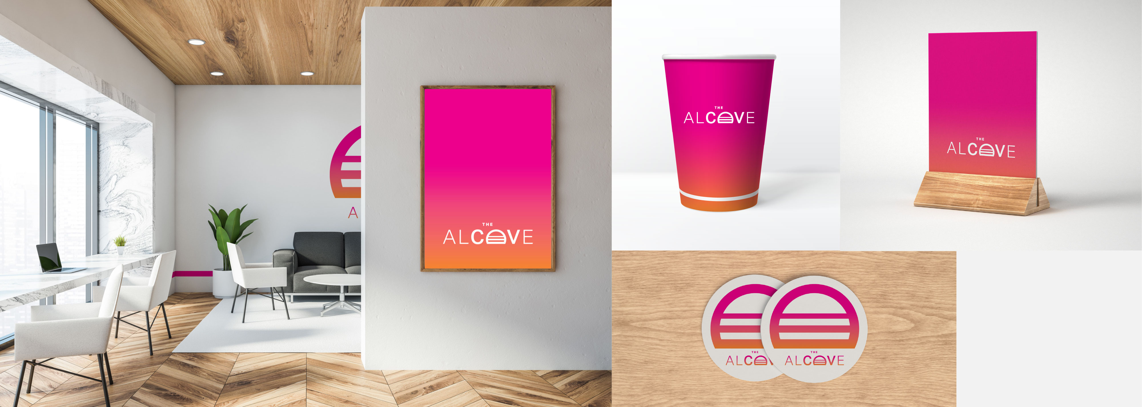
I used the cool spectrum from their branding for THE COVE and the warm spectrum for THE ALCOVE. They each would connect directly to the brand while having their own distinct character for each space.
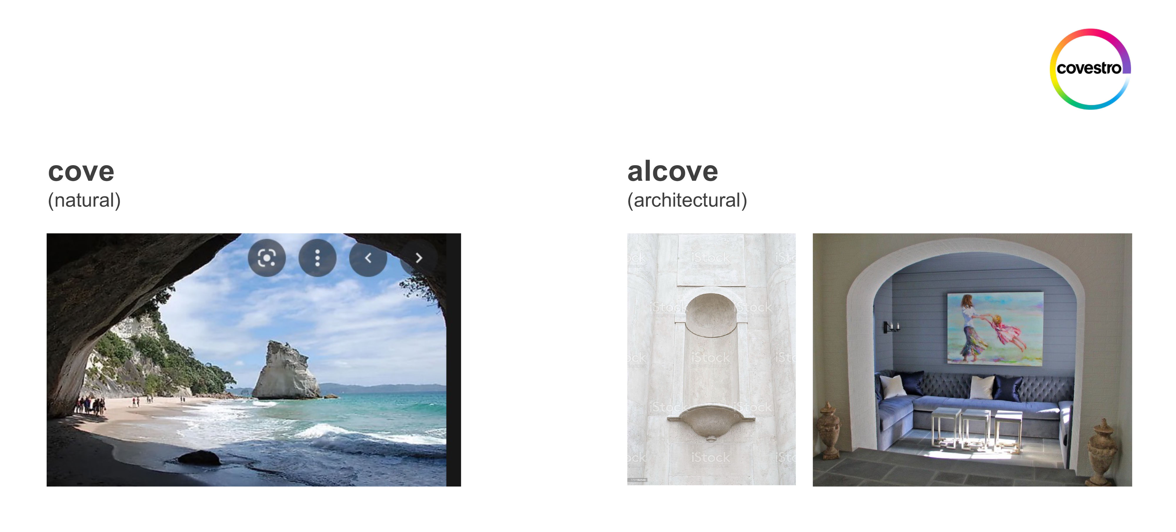
For inspiration, I explored the literal meanings of each word and extrapolated stylized abstract treatments for each.
In this first concept, a semicircle is leveraged to convey the overarching theme. THE COVE logo implies a shoreline view from within a natural cove.
As a complement to this first logo, THE ALCOVE utilizes a more architectural theme of straight lines indicative of steps or a window ledge.
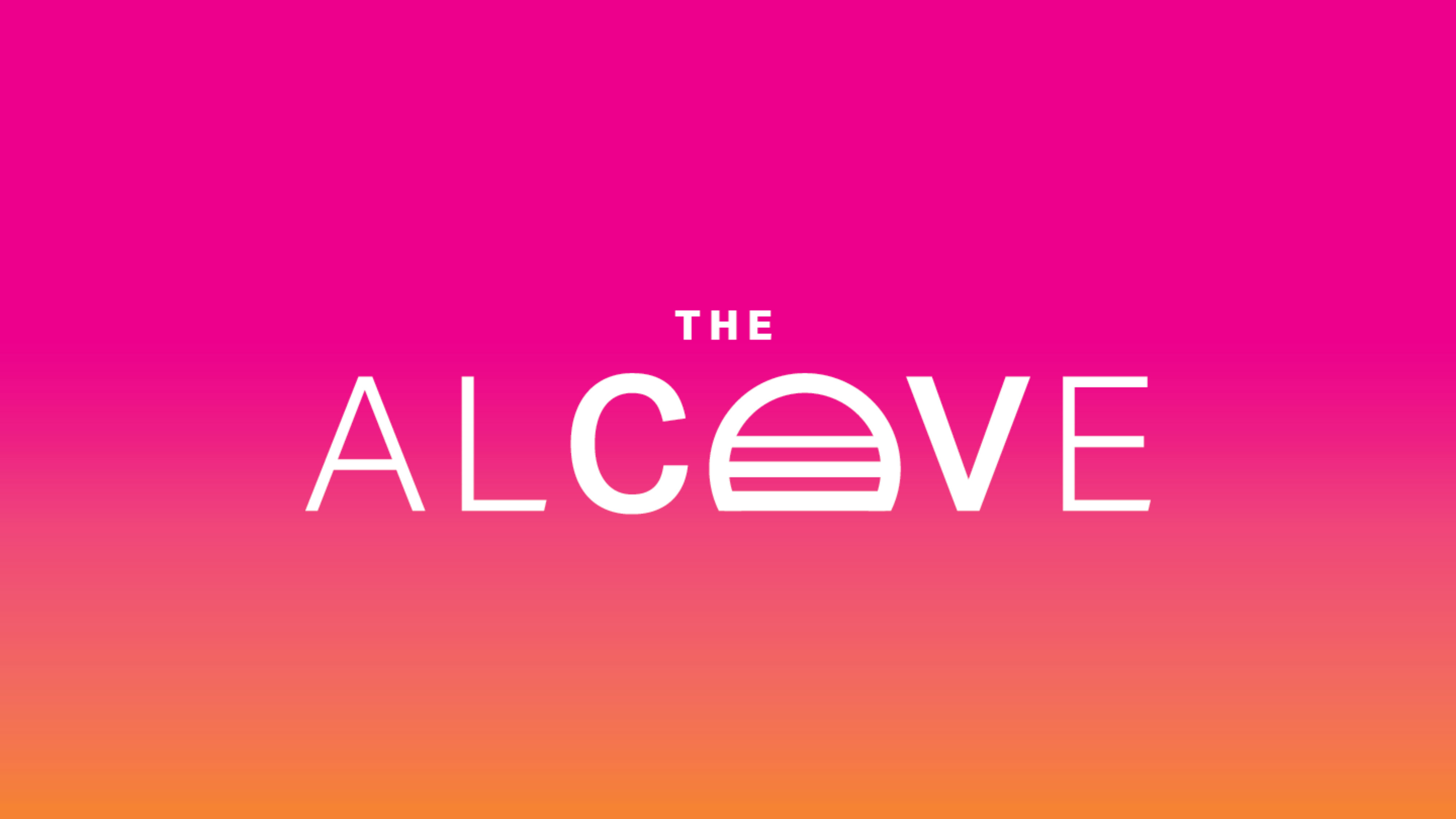
Paired with brand gradients, this option provides a clean, resort-like quality. Calming in its simplicity yet vibrant in its colors, this concept also conveys a welcoming and energizing space for employees to convene.
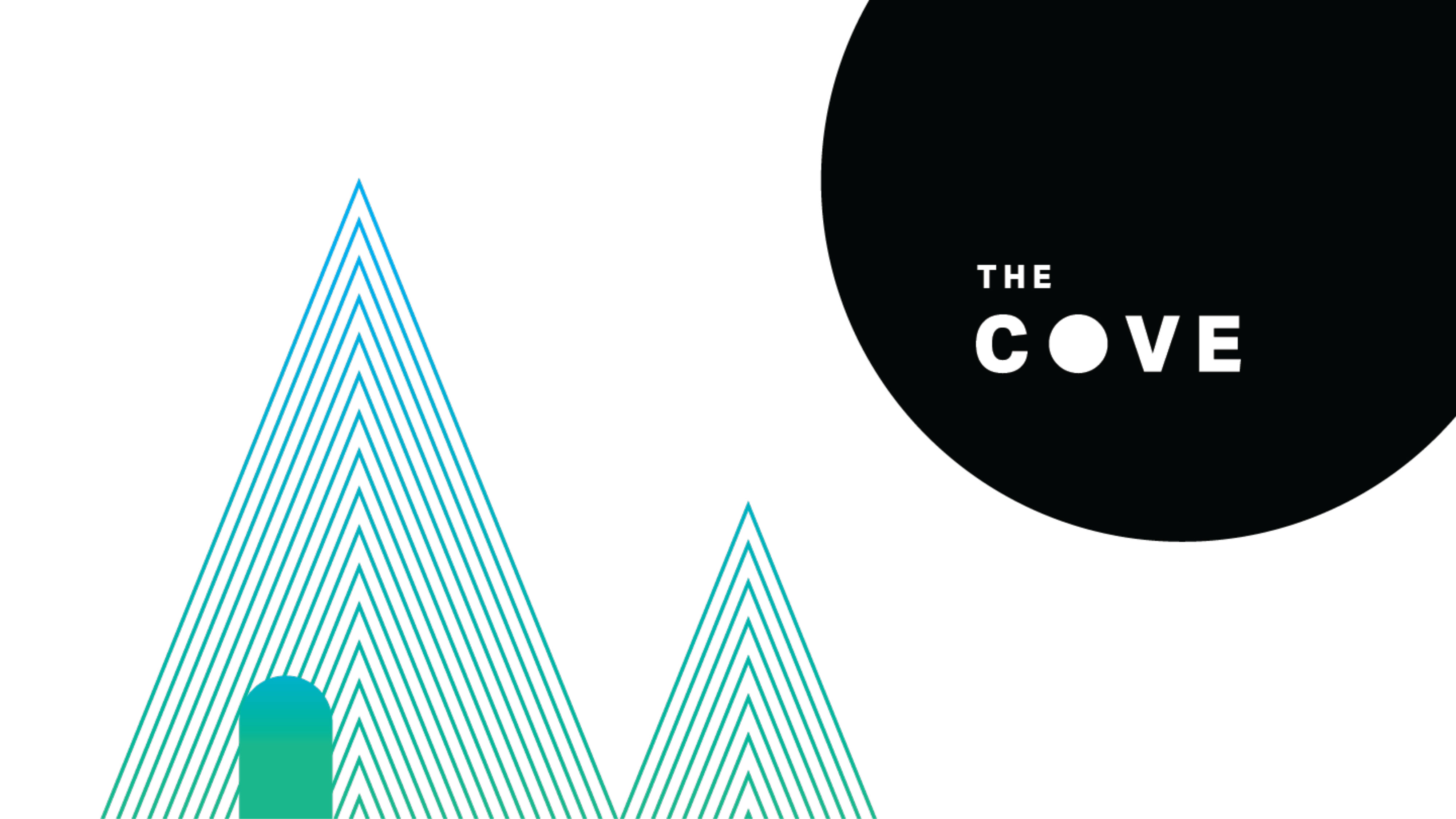
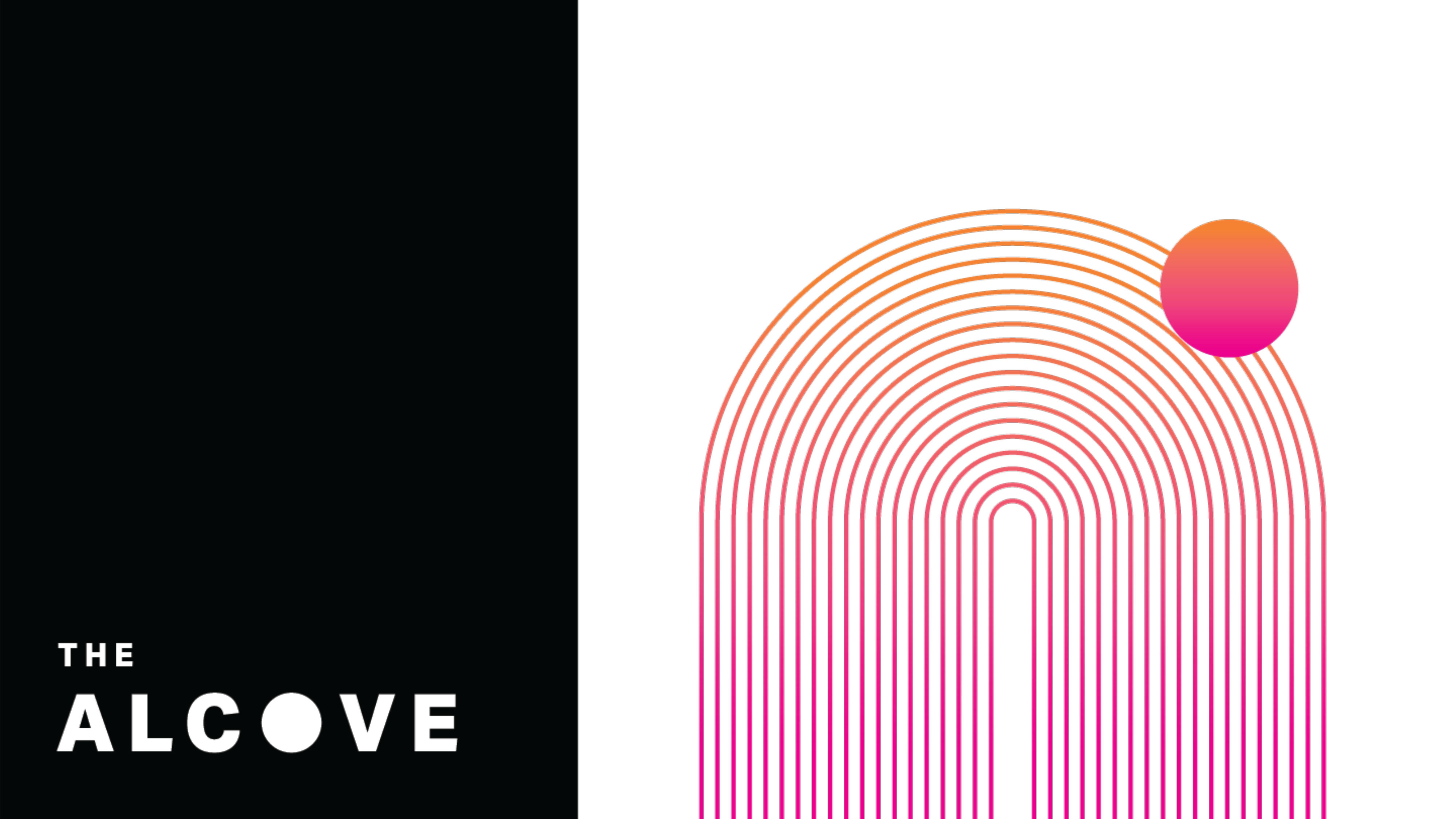
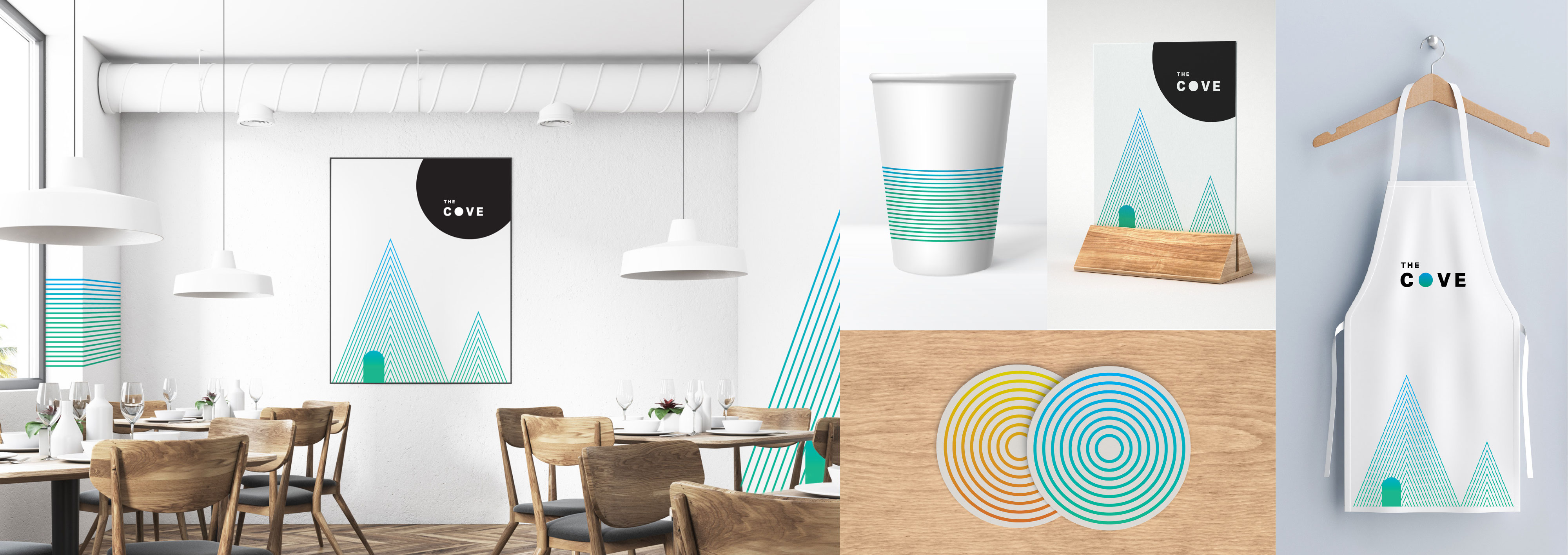
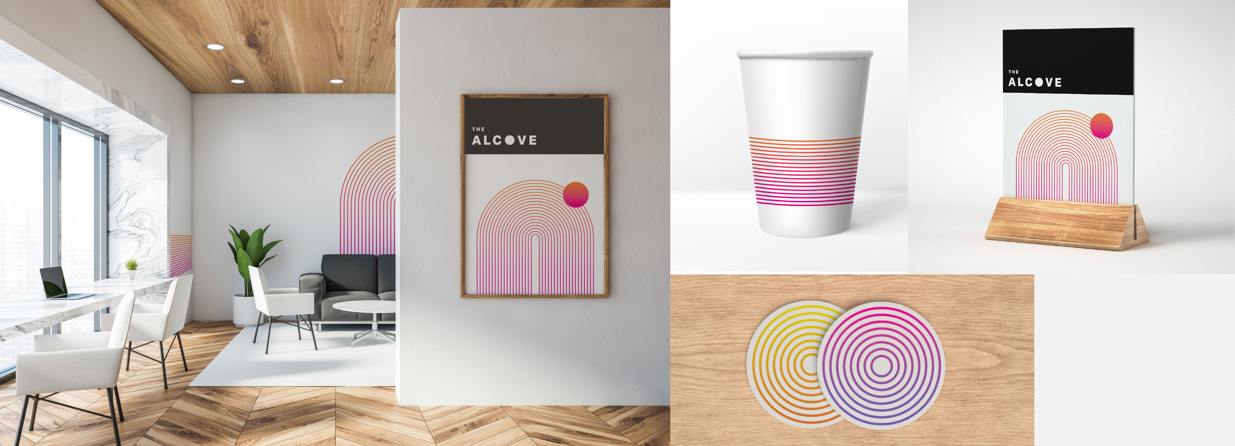
In this second concept, a mountainous scene is used as a graphic element for THE COVE logo. A high-contrast black circular shape, representative of a moon or sun, is used to feature the logo treatment. The curved shape of the architectural element is paired with a rectangular roof-like shape for THE ALCOVE logo. Geometric shapes are comprised of a series of lines. The many shapes representative of a whole are similar to how Covestro is comprised of many individuals within its organization who will come together in these shared community spaces.
