Luxe Nest
Logo and identity
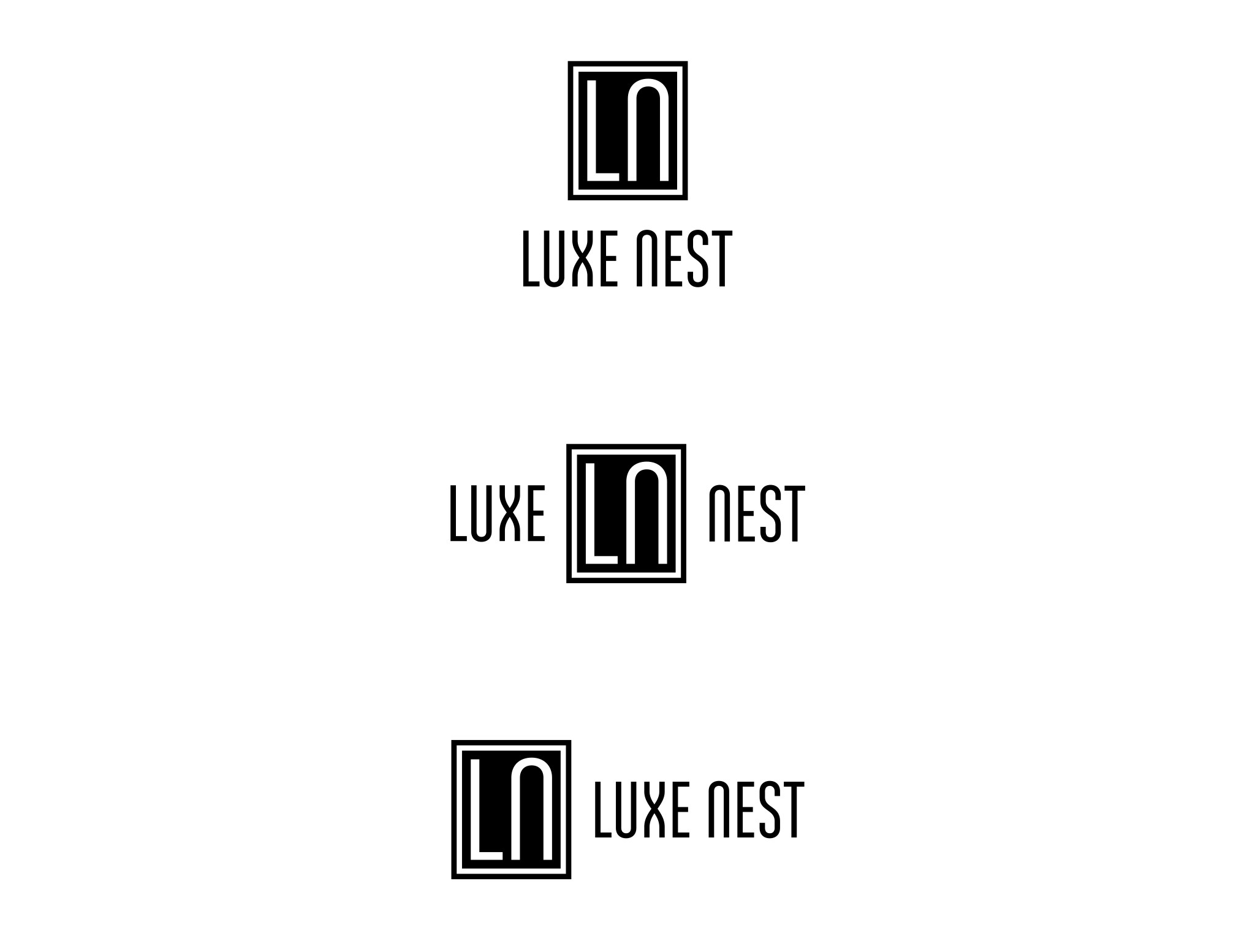
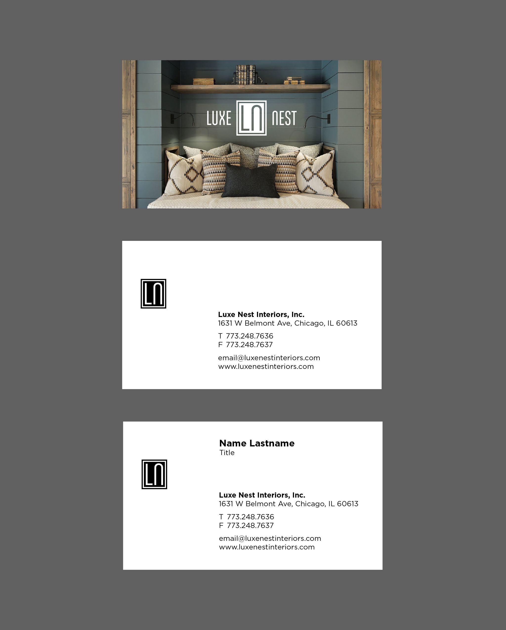
2 Design Group, for whom I had done a logo years ago, was changing their name to Luxe Nest and needed a new logo. They were drawn to the idea of a mongram-like logo but were open to other ideas.


The selected option above is bold and architectural and fit the mark perfectly for what they were looking for. Several other options that I explored are some personal favorites of mine.
Avian
Referential to the nest in their name, I experimented with expressions of a bird. Rendered in a mid-century modern style for a fresh architectural feel. A strong horizontal back is both eye-catching and graphic. Paired here with a horizontally elongated type treatment.
Referential to the nest in their name, I experimented with expressions of a bird. Rendered in a mid-century modern style for a fresh architectural feel. A strong horizontal back is both eye-catching and graphic. Paired here with a horizontally elongated type treatment.

Graphic Nest
Again with a literal exploration of the nest within their name, I imagined how a bird carefully selects and layers each branch to build a perfect home — what Luxe Nest similarly does for their clients. Symmetrical and clean, a diamond-like negative space was intentionally used to create a luxe feel.
Again with a literal exploration of the nest within their name, I imagined how a bird carefully selects and layers each branch to build a perfect home — what Luxe Nest similarly does for their clients. Symmetrical and clean, a diamond-like negative space was intentionally used to create a luxe feel.

Oak Leaf
As oaks are a common tree that birds use as nests, an abstraction of an oak leaf was used. Interesting fact, before Chicago was a city, oak trees were the most common tree in the area. This can be a subtle nod to the “roots” of where Luxe Nest was founded and operates. The first has the type “nested” within the leaf, the second version is separated.
As oaks are a common tree that birds use as nests, an abstraction of an oak leaf was used. Interesting fact, before Chicago was a city, oak trees were the most common tree in the area. This can be a subtle nod to the “roots” of where Luxe Nest was founded and operates. The first has the type “nested” within the leaf, the second version is separated.

Monogram Alternate
I explored countless monogram treatments. This was another of my and the client’s favorites. It uses tall, condensed, regal, and refined type with slight serifs that are evocative of leaves. I purposefully “nested” the letters together. The delicate bullet separating the logotype is an abstraction of either a diamond or leaf, both a direct connection to the name.
I explored countless monogram treatments. This was another of my and the client’s favorites. It uses tall, condensed, regal, and refined type with slight serifs that are evocative of leaves. I purposefully “nested” the letters together. The delicate bullet separating the logotype is an abstraction of either a diamond or leaf, both a direct connection to the name.


