UScellular
Newsroom website
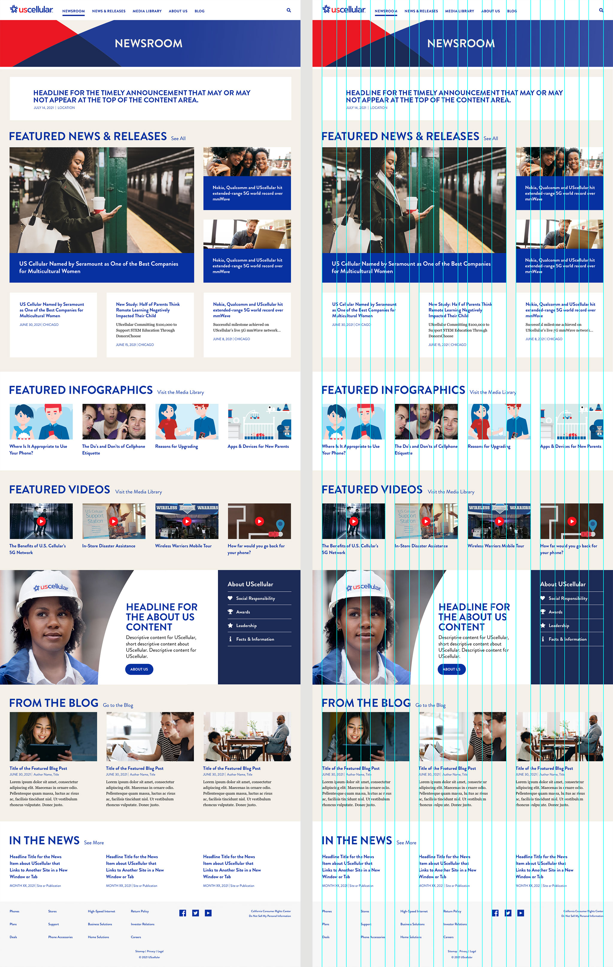
UScellular needed a new website dedicated to news releases. The site needed to be built from scratch separately from the main site so I went about designing a 12-column grid layout for the framework.

Working closely with a UX team, we architected the layout for each section.

Assets were a combination of images provided directly by the client and modified stock images. In some cases, I needed to retouch photographs to incorporate their newer logo. I'm particularly proud of this hero image of the UScellular team waving to the camera. I believe I did a pretty realistic replacement of all the logos on their t-shirts.

The sections on each landing page warranted some aspect of custom design that worked individually while remaining balanced with the page at large.

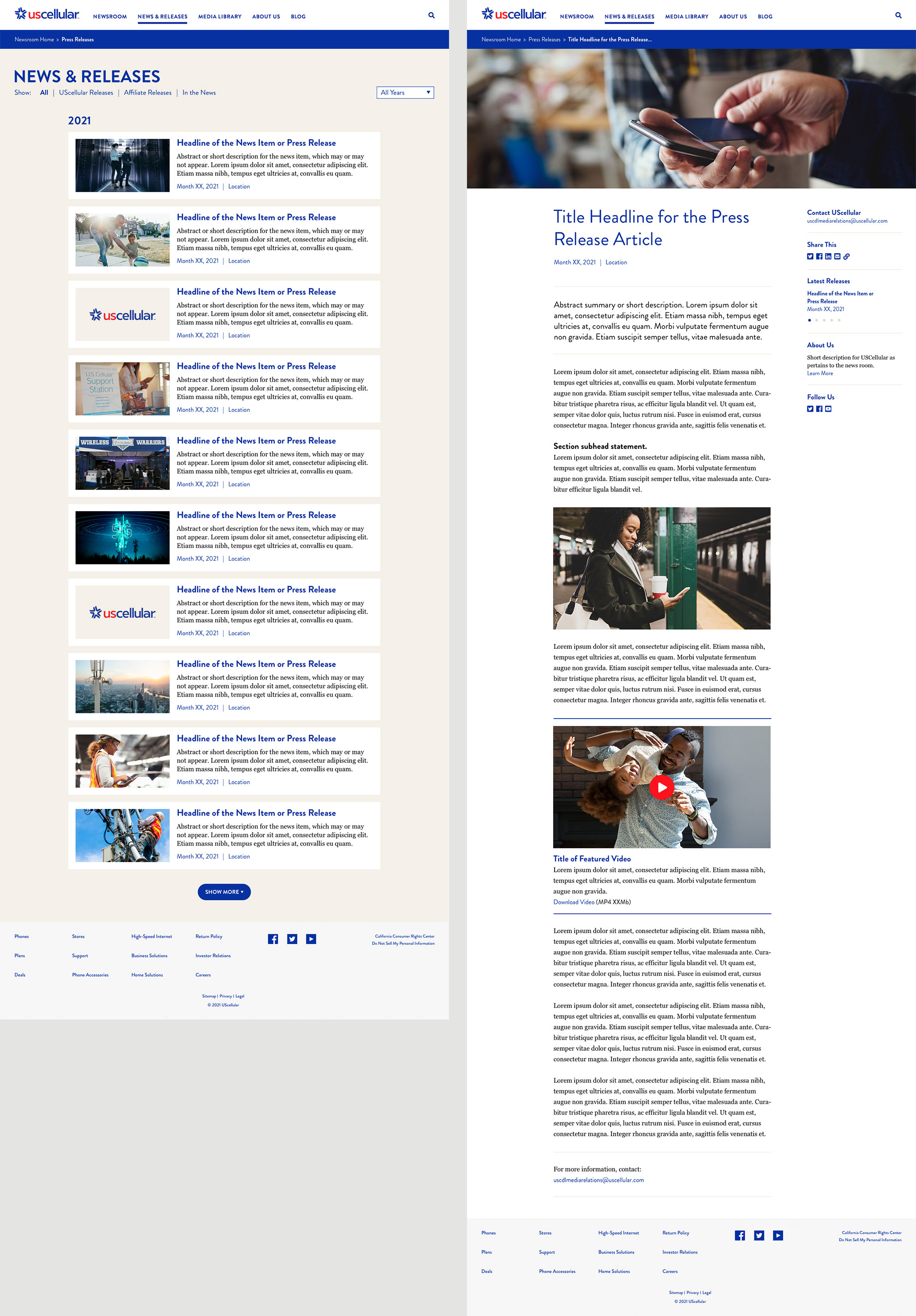
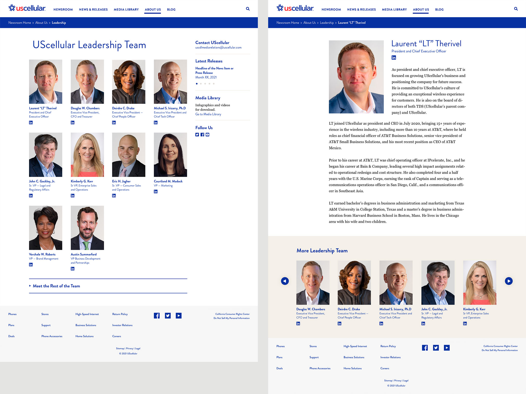
There was close attention to detail for each element on every page.

Landing pages were carefully balanced and flexible. Template pages were created for ongoing content needs such as blog posts.

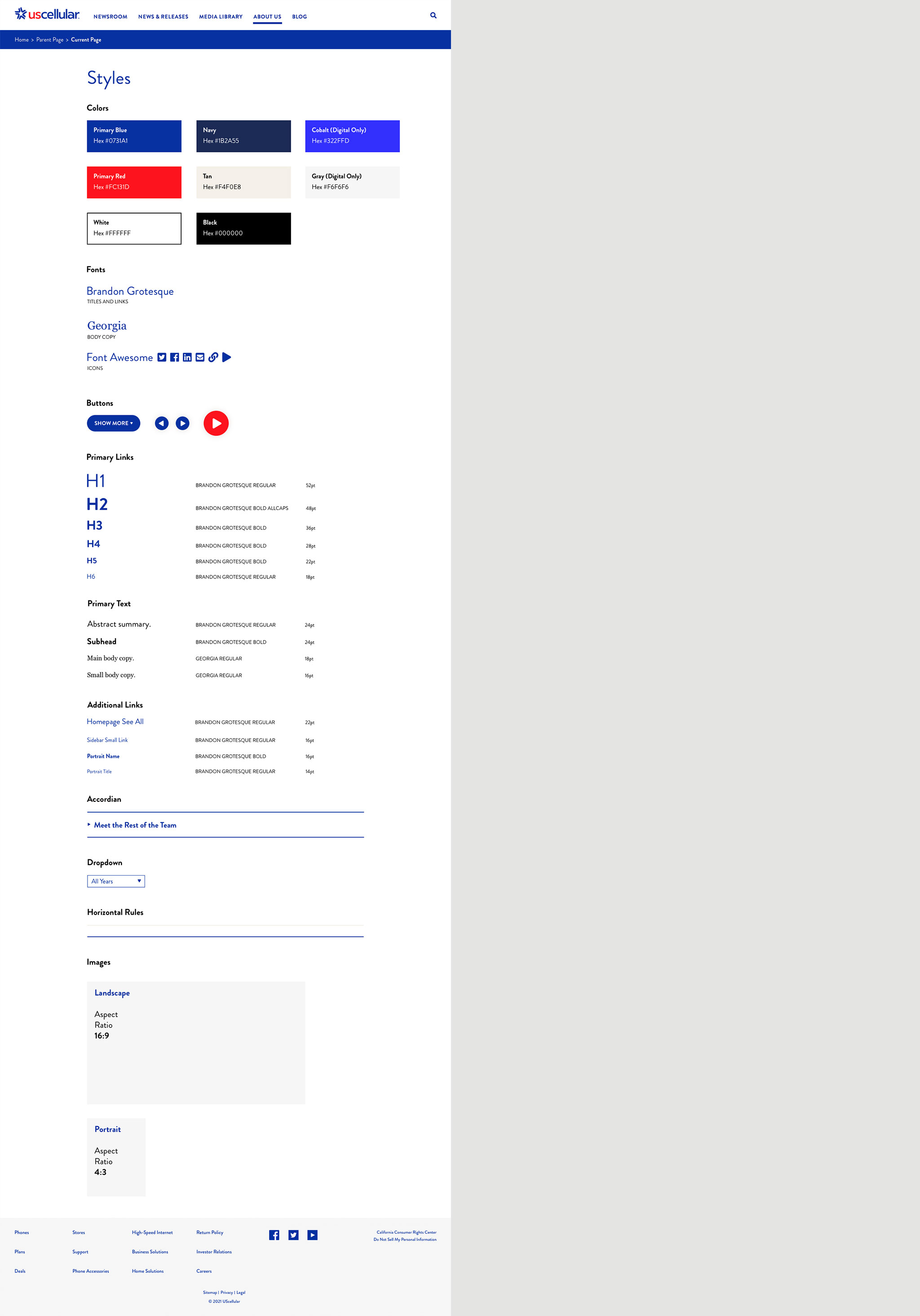
I created a styles page as a home base of sorts for design. This helped to ensure consistency across multiple pages. I worked tirelessly to reuse styles as much as possible to reduce the load on developers and for easier updates. This is a great start for developers to build out the core CSS styles and is a great reference for ongoing design needs.


